How to Reduce Annoying Checkout Form Fills

Form fills are a necessary part of the eCommerce checkout process. eCommerce businesses rely on them to gather required transaction data like shipping and billing addresses. Forms also help merchants achieve website conversions and gather important consumer information. For many online companies, form conversions are a key business-success metric because the information in form fills is valuable first-party data.
But forms are also a source of irritation for customers who often bail out rather than work through them. In fact, more than 67% of site visitors will abandon a checkout form process that’s too long or overly complicated. Customer frustration can lead to an eCommerce revenue killer known as form abandonment.
What Is Form Abandonment?
Form abandonment is what it sounds like. It’s when a customer starts to fill out an online form but leaves before completing it. Form fills can be so annoying to customers that 81% of them will abandon a form before finishing. Only 20% will follow up with a business in some way after quitting the form process. Security concerns (29%), form length (27%), advertisements or upselling (11%) and unnecessary questions (10%) are the main reasons customers abandon online forms.
The High Cost of Checkout Abandonment
Form abandonment and cart abandonment go hand in hand. Abandonment due to friction like too many form fields is a source of significant revenue loss for eCommerce brands. According to recent statistics, online businesses lose $18 billion in sales and revenue to cart abandonment each year. The current average abandonment rate is a whopping 69%.
Due to limited screen space and typing difficulties, form fields are even more unwieldy on mobile devices. The average abandonment rate on mobile phones is 85%. While form fills contribute heavily to that figure, many eCommerce websites are not fully optimized for mobile devices.
4 Ways to Reduce Form Fields
Today’s busy consumers don’t want to jump through hoops, so checkout page optimization is crucial for improving conversions and sales. The best way to streamline the checkout experience is to eliminate sources of friction like too many form fields. Here are a few ways eCommerce brands can reduce (or minimize) annoying form fills.
Have a Single Name Field
In many cases, users often find separate “First Name” and Last Name” fields at checkout. When presented with two naming fields, customers will often type out their full name in the “First Name” field. The reason is that most people think of their name as a single entity.
A simple solution is to offer users a single “Full Name” field. This easy fix can result in a 6% reduction in the total number of form fields. Still, 66% of sites currently require users to fill out two name fields. Another 20% have additional fields for “Middle Name” or “Suffix.”
Use Zip/Postal Code Autodetection
Users sometimes make spelling mistakes when typing their city name, resulting in validation errors that keep them from progressing through checkout. Users also slow down in their checkout journey when selecting their state, region or country from a long drop-down list.
To avoid these complexities, eCommerce brands can implement a zip code field that will auto-populate a user’s city and state. But, users should be able to override that input in case autodetection is wrong or fails. Doing so can result in a 13% reduction in the total number of open form fields.
Include Clickable Coupon or Promotion Codes
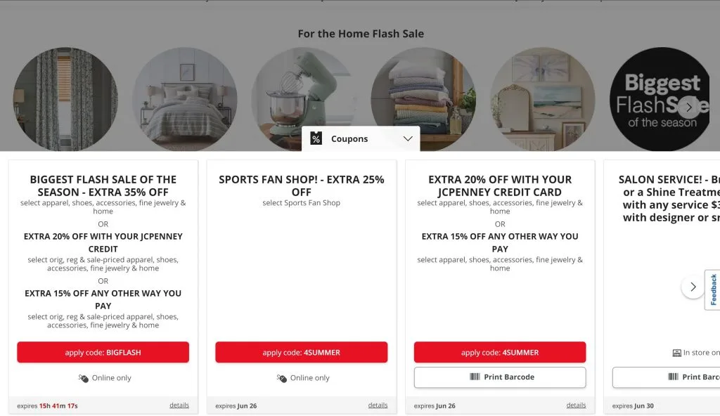 Coupon or promotion code fields can be as disruptive to the checkout path as the “Single Name” field. That’s because coupon fields take customers’ focus away from the checkout page. Lured by attractive savings, many users will leave a site entirely to search for the appropriate coupon code. If they cannot find it, they very often won’t return to the checkout page.
A good solution is to not include an open coupon code field on the checkout page. Instead, create a button that shoppers can click to use the applicable promo code. Despite the risk of abandonment, 48% of eCommerce sites display coupon code fields as open form fields.
Use “Billing Address = Shipping Address” by Default
Many eCommerce checkout pages default to use different shipping and billing addresses, resulting in needless form fields on the page. Multiple address fields are also a significant source of customer confusion. Users see an entirely identical and redundant set of fields when both addresses are displayed.
The best solution is to set “Billing Address = Shipping Address” by default. When the “Billing Address = Shipping Address” checkbox is selected, the billing address fields should be hidden rather than auto-filled. An exception to this tip is when order logs indicate that many customers use different addresses. Implementing this tip can result in a 37% reduction in the number of fields displayed.
The Bottom Line
The best way to reduce form abandonment is to provide customers with the best possible checkout experience. Brands can best achieve this by implementing the latest website and checkout page optimization and UX practices. Form analysis and A/B testing can help brands understand customer behavior and how they interact with forms.
Making the form process fun and user-friendly can also motivate customers to complete forms. Engaging and memorable quiz-like forms have the potential to triple conversions and build better customer retention and loyalty.
Striking a balance between gathering important user information and making forms so lengthy that users abandon the process can be tricky. Brands that streamline the form process can deliver the optimized shopping experience that today’s online customers demand.
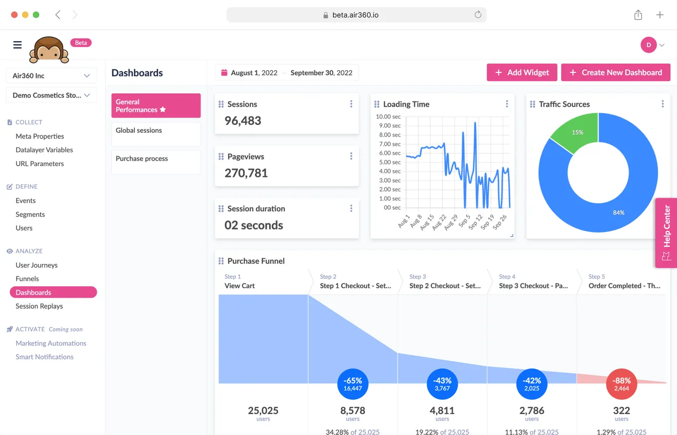
Field form and cart abandonment can be a thing of the past with Air360. Air360 helps eCommerce companies analyze their UX practices and make changes to increase conversion rates. Learn more by talking to one of our eCommerce experts or scheduling a demo today.
Download our CRO Checkout Recommendations Checklist and get quick wins to improve your checkout conversion at least 20% : https://baymard.com/lists/cart-abandonment-rate